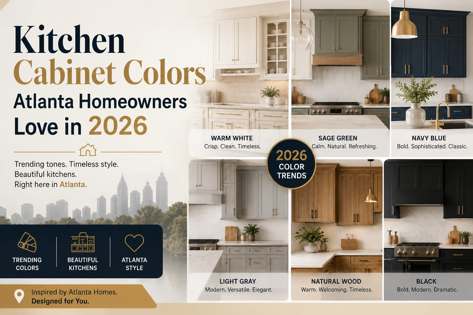
Walk through Inman Park, Decatur, or East Cobb right now and you'll notice the same shift happening across kitchens at every price point: the all-white, cool-gray palette that dominated Atlanta remodels from 2013 to 2022 is being replaced — gradually but clearly — by something warmer, more grounded, and more specific to the way Southern homes actually live.
This isn't a trend chasing national design publications. It's a response to something real: the way Atlanta light behaves differently from homes in the Pacific Northwest or New England, the way deep greens and warm creams have always worked in historic Craftsman bungalows and Colonial Revivals, and the way homeowners who overpainted in bright white five years ago are now living with the regret of a color that reads clinical under an overcast Georgia sky.
This guide covers the cabinet colors Atlanta homeowners are actually choosing in 2026, why each one works here specifically, what it pairs with, and the finish and application details that determine whether a color lands or falls flat.
Before getting to specific colors, one factor shapes every decision: Atlanta has a high-UV, high-humidity climate with distinct seasonal light shifts that affect how paint reads on a vertical surface throughout the day.
In summer, Atlanta kitchens receive intense, warm-spectrum afternoon light — particularly in south- and west-facing rooms. Colors that appear balanced in a Northern showroom often read yellow or orange under this light. Cool-toned whites that work in Seattle or Chicago interiors can shift chalky or flat in Atlanta's direct afternoon sun.
In winter, overcast days are common, and kitchens that rely on artificial lighting to compensate show every undertone flaw in a paint color. A white with a green undertone will look hospital-clean. A white with a pink undertone will look dated. A warm greige with a yellow base will read as one of the most livable neutrals in the room.
The practical rule: before committing to any cabinet color, pull the paint chip and look at it in your kitchen at 10 AM, 2 PM, and under your evening artificial light. The color that holds up across all three is the right choice.
Stark white cabinets — think pure titanium white with no undertone — are fading from Atlanta kitchens. The replacement isn't off-white in the dingy sense. It's a clean, warm white with a barely-there undertone of cream or pale yellow that keeps the kitchen feeling bright without the harshness that reads in Atlanta's direct summer light.
Why it works in Atlanta: Warm whites absorb the yellow-spectrum afternoon light rather than fighting it. The result is a kitchen that looks consistently clean across the full day's light cycle rather than shifting between bright and stark.
What it pairs with: Natural wood accents, brass or unlacquered bronze hardware, quartzite or honed marble countertops, white oak or warm-toned LVP flooring.
Paint references: Benjamin Moore Chantilly Lace (a true clean white with minimal undertone), Benjamin Moore White Dove (soft warm white, the most popular cabinet white in the Atlanta market right now), Sherwin-Williams Alabaster.
Application note: Warm whites show fingerprints and grease less visibly than stark whites on a matte or eggshell finish. On painted cabinets, a satin or semi-gloss sheen is easier to wipe down without showing scuff marks across the flat door face.
Sage green has moved from an emerging trend to a confirmed preference in Atlanta kitchens. In Midtown high-rises, Decatur Craftsman bungalows, and newer construction in Sandy Springs and Alpharetta, the same color family is showing up — muted, gray-green, neither too blue nor too yellow.
Why it works in Atlanta: Sage green is a natural complement to Atlanta's heavy tree canopy. In a kitchen with a window facing a backyard, sage green cabinets read as an extension of the outdoor palette rather than a contrast to it. It also handles the yellow-spectrum afternoon light better than cool blue-greens, which can shift muddy under strong sun.
What it pairs with: Soapstone or honed quartzite countertops (the gray tones anchor the green without competing), warm wood floors, oil-rubbed bronze or unlacquered brass hardware, white subway tile or zellige backsplash.
Paint references: Farrow & Ball Mizzle, Benjamin Moore Saybrook Sage, Sherwin-Williams Clary Sage, Behr Dusty Miller. Each sits slightly differently on the cool-warm axis — pull samples of at least three before committing.
Application note: Sage green reads differently on upper versus lower cabinets. On lowers only, it grounds the kitchen without overwhelming it. Full sage on uppers and lowers works in kitchens with significant natural light and white or light-toned countertops. In darker kitchens, sage lowers with warm white uppers is the more reliable two-tone approach.
Navy blue on lower cabinets has been earning its place in Atlanta kitchen design for the past three years, and in 2026 it's moved from bold choice to confident standard. The key word is deep — a flat, muted navy rather than a bright cobalt or royal blue.
Why it works in Atlanta: Deep navy anchors a kitchen visually without the heaviness that darker colors can create in smaller spaces. In Atlanta's older housing stock — where kitchens are often narrower than contemporary open-plan designs — navy lowers with light uppers create a visual separation that makes the room read as more considered and larger than it is.
What it pairs with: Warm white or cream upper cabinets, brass hardware, light-toned quartzite or marble countertops, light wood floors. Navy also works against black-and-white tile floors common in Atlanta's 1920s and 1930s bungalows.
Paint references: Benjamin Moore Hale Navy (the most widely used navy in Atlanta kitchens), Benjamin Moore Van Deusen Blue, Sherwin-Williams Naval, Farrow & Ball Hague Blue (deeper and more green-toned, worth seeing in person before committing).
Application note: Navy reads significantly darker in a low-light kitchen than it does on a paint chip. If your kitchen has limited natural light and you're drawn to navy, test the darkest reference in your actual kitchen under both natural and artificial light before pulling the trigger. A navy that works in a light-flooded Buckhead renovation may close in uncomfortably in a north-facing Kirkwood kitchen.
The cool gray cabinet wave — dominant in Atlanta remodels from roughly 2016 to 2022 — has largely run its course. The replacement isn't a dramatic swing to bold color; for many Atlanta homeowners, it's a warmer, more complex neutral that reads as neither beige nor gray but somewhere between them.
Greige (gray-beige) in a warm-toned version is one of the most consistent performers in Atlanta kitchens because it responds well to the light conditions described above — it picks up warmth from afternoon sun rather than reading flat, and it bridges wood-toned floors and white countertops without the neutrality of a stark white or the commitment of a statement color.
Why it works in Atlanta: It reads differently across light conditions without ever reading wrong. It also ages well — in five years it won't feel as dated as trend-driven color choices.
What it pairs with: Nearly everything. It's a genuine neutral. Works with brass, chrome, or oil-rubbed bronze hardware. Pairs with wood-tone and tile floors equally. Compatible with quartz, quartzite, granite, and butcher block countertops.
Paint references: Sherwin-Williams Accessible Beige, Benjamin Moore Pale Oak, Sherwin-Williams Agreeable Gray (leaning cool — verify in your light), Benjamin Moore Revere Pewter (a classic that's aged slightly but still performs).
Application note: The difference between a greige that reads warm and one that reads dirty is the undertone. Yellow and pink undertones age well in Atlanta light. Green undertones can shift toward khaki under certain artificial lights. Always test.
Black cabinets had a significant moment in Atlanta kitchen design, particularly in new construction in Buckhead and Midtown. Full black is now giving way to warm charcoal — a dark gray with brown or warm undertones that delivers visual authority without the starkness of true black.
Why it works in Atlanta: Warm charcoal on lower cabinets or a kitchen island gives a kitchen a strong anchor without requiring the high contrast of black-and-white. In kitchens with warm wood floors — common in Atlanta's older housing stock — charcoal sits comfortably in the same warm color family rather than fighting the floor tone.
What it pairs with: Light countertops (white quartzite, light marble, light quartz), brass or unlacquered bronze hardware, warm white upper cabinets or open shelving. Also strong against a patterned or dark-grout tile backsplash.
Paint references: Benjamin Moore Wrought Iron, Sherwin-Williams Urbane Bronze (warmer, with brown undertones — one of the most interesting dark neutrals for Atlanta kitchens), Farrow & Ball Mole's Breath.
Application note: Warm charcoal is less unforgiving than black when it comes to dust and water spots on the door face. Satin or semi-gloss sheen on a dark cabinet is practical — it allows wiping without leaving a dull mark the way matte finishes do.
The most forward-facing direction in Atlanta cabinet color for 2026 is also the least expected: warm, earthy terracotta and clay tones. Not the orange-red terracotta of 1990s Southwestern design — a softer, more muted clay that reads as a natural extension of the sage green and warm greige palette.
Why it works in Atlanta: Atlanta's design culture has always had a relationship with earthy Southern tones — the red clay soil, brick facades of midcentury neighborhoods, the warm-spectrum afternoon light. A muted terracotta on a kitchen island or as an accent color on a single cabinet run references that palette without leaning into pastiche.
Where it's showing up: Primarily on islands and butler's pantries rather than full kitchen runs. It's a strong accent color paired with warm white perimeter cabinets and a natural stone countertop.
What it pairs with: Warm white or cream upper cabinets, unlacquered brass or hand-hammered iron hardware, travertine or warm-veined quartzite countertops, terracotta tile or warm wood floors.
Paint references: Farrow & Ball Red Earth (muted, complex — not orange), Benjamin Moore Rockport Gray with warm-toned decor (a softer entry point), Clare Cinnamon Sugar, Sherwin-Williams Cavern Clay.
The majority of Atlanta kitchens being designed or renovated in 2026 aren't choosing one cabinet color — they're choosing two. The upper-lower split has become the dominant approach across price points, and the combinations that are showing up most consistently are:
The proportion rule: In a two-tone kitchen, the lighter color should dominate by area. A 60/40 split — lighter color on the more visually prominent run, darker color as the anchor — is the reliable starting point. Equal area splits between light and dark colors often feel unresolved.
Color choice is only half the decision. The finish sheen affects how the color reads, how the surface cleans, and how long the paint holds up.
Satin is the most practical finish for painted kitchen cabinets. It's wipeable without being high-gloss, holds color accurately, and doesn't show brush marks or roller texture the way semi-gloss can on flat door faces. Most professional kitchen cabinet painters in Atlanta use a satin or soft-sheen conversion varnish over the primer and paint stack.
Semi-gloss is appropriate for dark colors — navy, charcoal, black — where the slight sheen reads as intentional and makes the surface easier to maintain. On lighter colors, semi-gloss can emphasize surface imperfections and look closer to a lacquer finish than most homeowners want in a residential kitchen.
Matte and flat finishes are not recommended for painted kitchen cabinets. They're harder to clean, mark easily from routine wiping, and don't hold up well to the grease and steam that a kitchen produces over years of use.
Cabinet-specific paint: Standard wall paint is not the right product for cabinet doors. A furniture-grade alkyd or waterborne alkyd paint, or a two-part conversion varnish applied by a professional, will hold up significantly longer on a kitchen cabinet door than standard interior latex. The preparation — sanding, cleaning, and priming properly — is as important as the paint itself.
Rather than choosing a color from a trend list and hoping it works, the better approach is to sequence the decision correctly:
Step 1 — Identify your fixed elements first. Flooring, countertops, and backsplash are the materials the cabinet color needs to live with. If you're keeping your existing hardwood floors, identify their undertone (warm/yellow, cool/gray, or neutral) before picking a cabinet color. The cabinet color should complement the floor's undertone, not contrast with it.
Step 2 — Pull three to five samples and test them in your kitchen. Not in a showroom, not in the paint store. In your kitchen. Tape large samples to the actual cabinet doors and observe them across morning light, afternoon direct sun, and evening artificial light. Give each sample at least two days before deciding.
Step 3 — Evaluate the hardware. Brass hardware reads warmer and pulls toward sage green, warm white, and terracotta. Chrome and brushed nickel read cooler and suit navy, charcoal, and cool-toned whites better. Unlacquered bronze is the most versatile option across the full Atlanta cabinet color palette.
Step 4 — Decide on perimeter vs. island color separately. The island is a natural candidate for an accent color. It's a contained surface, it's visually distinct from the perimeter run, and it allows you to introduce a stronger color without committing the whole kitchen to it.
Step 5 — See the color on a door profile, not just a chip. A paint color looks different on a flat slab door, a recessed shaker panel, and an inset door with an exposed face frame. The shadow created by the panel profile affects how the color reads. Any good kitchen cabinet store in Atlanta will have display doors painted in popular colors you can evaluate in person.
Q: What is the most popular kitchen cabinet color in Atlanta right now? In 2026, the most requested cabinet color in Atlanta is warm white — specifically Benjamin Moore White Dove — followed closely by sage green on lower cabinets. Two-tone combinations with warm white uppers are the most common overall approach across kitchen renovations at all price points.
Q: Should kitchen cabinets match the trim color? They don't need to match exactly, but they should relate. If your trim is a warm white, cabinet doors in a warm white at a slightly different sheen level (trim in semi-gloss, cabinets in satin) is a clean and cohesive approach. If you're introducing a color — sage green, navy, or charcoal — the trim should stay neutral so it frames rather than competes with the cabinets.
Q: Will a dark cabinet color make my Atlanta kitchen feel smaller? It depends on the layout and light. Dark cabinets on lower runs with light uppers and light countertops actually give smaller kitchens more perceived depth — the visual separation between upper and lower planes makes the room read more complex and interesting. Dark color on all four walls of a small kitchen with limited natural light is more likely to feel heavy.
Q: How long does a painted cabinet finish last before needing refinishing? A professionally applied furniture-grade paint or conversion varnish on properly prepared cabinets will hold up 8 to 12 years with normal kitchen use before showing meaningful wear at high-contact areas — door edges, drawer faces, and the area around pulls. DIY repaints with standard interior latex often need touch-up within 3 to 5 years.
Q: Can I repaint my existing cabinets instead of replacing them? Yes — if the box is plywood and structurally sound, the face frames are tight, and the door profile is one you want to keep, a professional repaint with new hardware is a cost-effective way to get a current color without full cabinet replacement. The quality of the preparation — cleaning, deglossing, sanding, and priming — determines whether the repaint holds for years or starts peeling within months.
Q: Where can I see current Atlanta kitchen cabinet color options in person? Visit a dedicated kitchen cabinet store in Atlanta that carries semi-custom lines with painted door samples across their current color range. Looking at actual door samples under your kitchen's light conditions — rather than evaluating colors digitally or from small chips — is the most reliable way to make a confident color decision.
Color is the most personal decision in a kitchen renovation — and the one that's hardest to undo if it goes wrong. The homeowners who consistently land on colors that work aren't making bolder choices than everyone else. They're doing the work of testing samples in their actual kitchen, under their actual light, against their actual flooring and countertops, before committing.
The Atlanta-specific patterns in this guide — the preference for warm whites over stark whites, the performance of sage green under Southern afternoon light, the growing move toward earthy terracotta and two-tone combinations — aren't arbitrary. They come from how Atlanta homes are built, how Atlanta light behaves, and what Atlanta homeowners are finding actually works after living with their choices.
If you're working through a cabinet color decision and want to see painted door samples in person across the full 2026 palette, Homes Cabinet carries a range of finished door profiles in the colors covered in this guide — so you can make the comparison with real materials in your hand before the paint order goes in.
May 15,2026