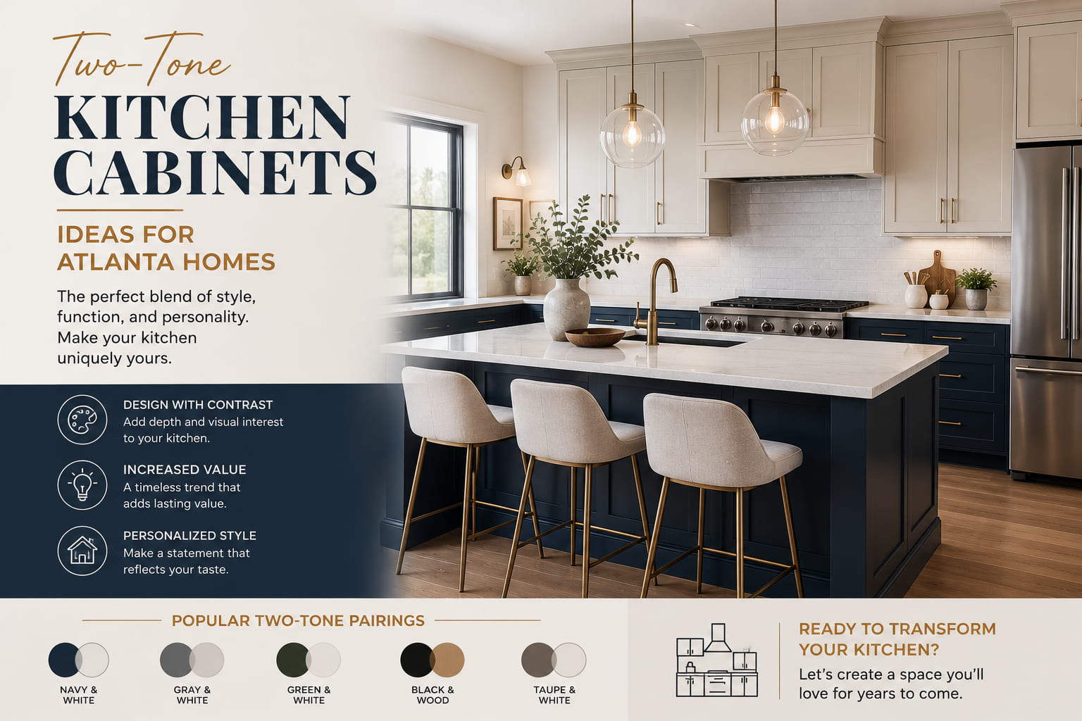
Single-color kitchens are not going away — but in Atlanta remodeling conversations right now, two-tone cabinet combinations are coming up in nearly every design consultation at every price point. It's not a fad driven by social media. There's a practical reason it's working: it gives a kitchen visual layers that a single color can't produce, and it lets homeowners introduce a color they love without committing the entire room to it.
The challenge is that two-tone also has more failure modes than a single-color approach. The wrong contrast level in the wrong light condition reads as busy rather than intentional. Colors that look balanced on a mood board can fight each other in a kitchen with warm oak floors and afternoon sun hitting the west-facing wall. Getting it right requires sequencing the decisions correctly — and knowing which combinations hold up in Atlanta kitchens specifically, not just in the design press.
This post covers the combinations that are working in Atlanta homes right now, the layout logic behind them, and the decisions that separate a two-tone kitchen that looks considered from one that looks like a mistake.
The case for two-tone is structural, not stylistic. A single cabinet color on every surface — upper cabinets, lower cabinets, island, and pantry — flattens the kitchen visually. The eye has nothing to move between. Two colors create a visual separation between planes that makes the room read as more layered and intentional.
The lower cabinets sit in your sightline differently than the uppers. They anchor the room to the floor. They take more physical contact — hands on doors, knees against toe kicks, spills on drawer faces. They're also the surface most people engage with at eye level while cooking. The upper cabinets sit above the counter line and function as a backdrop. Treating them as two distinct design zones — which is exactly what two-tone cabinetry does — reflects how the kitchen actually works.
Where two-tone fails is when the contrast level is misjudged. Too little contrast and the two colors read as a mistake — like the painter used up one can and opened another. Too much contrast in a small or low-light kitchen and the two planes compete visually, making the space feel smaller and fragmented.
The reliable rule: in kitchens under 150 square feet or with limited natural light, keep the contrast moderate — a warm white upper against a muted sage or soft greige lower. Reserve high-contrast combinations (warm white against deep navy or charcoal) for kitchens with strong natural light and room to absorb the visual weight.
This is the most requested two-tone combination at kitchen cabinet stores in Atlanta right now — and it's earning that position for real reasons, not just because it photographs well.
Warm white uppers keep the upper portion of the kitchen open and bright, which matters in Atlanta's older housing stock where ceiling heights are often 8 to 9 feet and upper cabinet runs sit close to the ceiling line. Sage green lowers ground the kitchen in a natural, earthy tone that reads consistently across Atlanta's range of seasonal light — it picks up warmth from summer afternoon sun without going muddy, and holds its character under overcast winter light.
What makes it Atlanta-specific: Sage green references the landscape outside most Atlanta windows — heavy tree canopy, deep greens through spring and summer. In a kitchen with a window facing a backyard, the transition between sage green lowers and what's visible outside is seamless rather than jarring.
What it pairs with:
Paint references: Benjamin Moore White Dove on uppers. Farrow & Ball Mizzle, Sherwin-Williams Clary Sage, or Benjamin Moore Saybrook Sage on lowers. Pull actual door samples in both colors side by side before committing — the gap between them on a chip and on a full door face is significant.
High contrast, high commitment — but when it works, it's one of the strongest kitchen looks in Atlanta's current renovation market. Deep navy lower cabinets read as architectural rather than decorative. They carry the weight of a dark element without the austerity of black.
This combination works best in Atlanta kitchens with strong natural light — south- or east-facing rooms where direct morning or afternoon light hits the cabinet faces and keeps the navy from going flat. In a north-facing kitchen with limited windows, deep navy lowers can close in quickly.
Where it shows up in Atlanta: Newer construction in Buckhead, Midtown, and Sandy Springs where open-plan layouts provide the spatial volume to absorb a high-contrast combination. Also appearing in Decatur bungalow renovations where the contrast between navy lowers and white uppers references the two-tone paint treatments common on Craftsman exteriors.
What it pairs with:
Paint references: Benjamin Moore Hale Navy, Sherwin-Williams Naval, Farrow & Ball Hague Blue (runs blue-green — verify in person). On uppers: Benjamin Moore Chantilly Lace or White Dove.
The proportions: Navy lowers, white uppers, light countertops, light floor — the dark element occupies roughly 30 percent of the total visual field. When navy starts taking up more than that (dark lowers, dark island, dark backsplash), the kitchen loses the contrast logic that makes the two-tone combination work.
The island as the accent piece — perimeter cabinets in warm white or greige, island in a stronger color — is the most flexible two-tone approach for Atlanta homeowners who want to test a color without committing the full kitchen to it.
It works because the island is visually contained. It's a discrete piece of furniture in the middle of the room, not a continuous run of cabinetry. A color that would feel aggressive on every lower cabinet in the kitchen reads as confident and deliberate on an island.
Colors that are working on Atlanta kitchen islands right now:
Deep navy — the most common island accent choice. Creates a focal point in the kitchen without the commitment of navy on all perimeter lowers.
Warm charcoal — reads as sophisticated without the high contrast of black. Works particularly well against warm white perimeter cabinets and brass hardware on the island.
Sage green — when homeowners want sage but aren't ready for full lower cabinets in the color, the island is the right starting point. It lets the color live in the room without dominating it.
Terracotta or clay — an emerging choice in Atlanta kitchens in 2026. Muted, earthy terracotta on an island against warm white perimeter cabinets references Atlanta's natural palette — red clay, brick facades, Southern earth tones — in a way that feels locally rooted rather than trend-borrowed.
Deep forest green — darker than sage, more saturated, with more presence. Works in larger kitchens where the island is substantial enough to carry a stronger color.
What it pairs with: This approach is the most forgiving in terms of countertop and floor combinations because the color is concentrated on a single contained piece. The island countertop can match the perimeter or contrast it — butcher block on a navy island against white quartz perimeter countertops is one of the most practical and visually effective combinations in Atlanta kitchens right now.
The inverse of the typical two-tone logic — a slightly warmer, slightly deeper tone on the upper cabinets, lighter on the lowers — is a more subtle approach that produces depth without contrast.
This reads as a single-color kitchen to most visitors, but it creates a visual interest that a true single color can't replicate. The upper cabinets recede slightly against the ceiling; the lower cabinets read as cleaner and brighter. The separation is tonal rather than dramatic.
When to use this approach: In kitchens where the homeowner wants visual complexity without committing to a color statement. In smaller Atlanta kitchens where high contrast would be too much. In homes being prepared for resale where a bold two-tone could polarize buyers.
Paint references: Benjamin Moore Pale Oak or Sherwin-Williams Accessible Beige on uppers. Benjamin Moore White Dove or Chantilly Lace on lowers.
The wood-and-paint combination is historically accurate in American kitchen design and has a specific relevance in Atlanta's large stock of Craftsman, Colonial Revival, and mid-century homes. Upper cabinets in a clean white or warm white, lower cabinets in a stained wood — white oak, cherry, or walnut — gives the kitchen an honest, material-forward character that painted two-tone combinations can't replicate.
This isn't a new direction. It's a return to the way kitchens were built before the all-painted look became dominant in the 1990s. And it's showing up across Atlanta renovations because it suits the architecture of the houses that most Atlanta homeowners are living in.
What makes it work structurally: The painted upper cabinets reflect light into the kitchen and keep the upper plane open. The stained wood lowers ground the room in a material that ages and patinas over time — the opposite of the painted cabinet, which shows wear and needs repainting. The wood lower is more durable at high-contact areas and requires less maintenance over a 15-to-20-year period.
Wood species choices for Atlanta kitchens:
What it pairs with: Quartzite, soapstone, or honed marble countertops. Simple hardware in unlacquered brass or oil-rubbed bronze. A backsplash that doesn't compete — white subway tile or a tonal natural stone mosaic.
Choosing the right colors is only half the decision. The layout logic — which surfaces get which color, and in what proportion — determines whether the combination reads as deliberate or accidental.
In a two-tone kitchen, the lighter or more neutral color should cover more surface area than the stronger color. A 60/40 split — lighter color on the dominant run, stronger color on the secondary run — is the reliable starting point. When the two colors split evenly across equal surface area, the result often feels unresolved.
In practice: if your perimeter cabinet run is 24 linear feet total — 12 upper, 12 lower — the 60 percent color goes on the uppers. The 40 percent color goes on the lowers. The island, if present, falls outside this ratio and is treated as a separate accent element.
The island is not part of the upper-lower ratio. It's a separate visual plane — furniture-like in its relationship to the room — and it should be color-planned independently. Options:
In Atlanta kitchens where the homeowner wants two-tone but is cautious about committing to upper cabinets in a second color, open shelving on one run of uppers is an effective transition. It creates a visual break between the lower cabinet color and the ceiling without the commitment of a second painted cabinet color. The styling on the open shelf — hardware, pottery, glassware — can pick up tones from both cabinet colors.
The color change in a two-tone kitchen should occur at a clear architectural line — the countertop plane, where upper and lower cabinets are separated by the counter surface and a backsplash. That horizontal break gives the color transition a physical reason to exist. When homeowners try to break the colors mid-run on the same cabinet wall without a clear architectural separator, the result reads as incomplete.
Walking into a kitchen cabinet store in Atlanta with a two-tone concept in your head and walking out with a confident decision are two different things. A few ways to use the showroom visit effectively:
Ask to see display kitchens with two-tone combinations, not just single-color samples. Most showrooms at established kitchen cabinet stores in Atlanta have full display kitchen setups. Two-tone reads very differently at full scale than it does from small door samples on a card.
Hold the two door samples side by side under the showroom lighting, then take them to a window. The gap between how two colors relate under fluorescent showroom light and natural daylight can be significant. A sage green and warm white that look balanced under artificial light may have more or less contrast under natural light.
Ask what the most common two-tone combination is for your price point. A showroom that sees hundreds of Atlanta kitchen projects per year has real data on what's working. That's worth asking directly.
Request the door samples to take home. Any Atlanta kitchen cabinet store worth using will loan sample doors. Hold the actual door faces — not paint chips — against your flooring, your existing countertop, and your wall color before committing. The door face is the surface you'll be looking at every day.
Q: Do upper and lower cabinets have to be different colors in a two-tone kitchen? No — the upper-lower split is the most common application but not the only one. A contrasting island against single-color perimeter cabinets is a two-tone kitchen. So is an accent pantry cabinet or a single run of lower cabinets in a different color against the rest of the perimeter. The upper-lower split became dominant because it follows the natural architectural break created by the countertop and backsplash.
Q: What is the most popular two-tone kitchen cabinet combination right now? In Atlanta, the most requested combination in 2026 is warm white uppers with sage green lowers. Nationally, warm white with navy is the dominant pairing across design press. Both are working in Atlanta kitchens — the right choice between them depends on your kitchen's natural light level and the contrast level you want to live with.
Q: Can you do two-tone cabinets in a small kitchen? Yes, but the contrast level needs to be moderated. High-contrast combinations — white against deep navy or charcoal — work best in kitchens with good natural light and room to absorb the visual weight. In smaller Atlanta kitchens, a tonal two-tone approach — warm white uppers against a muted sage or warm greige lowers — delivers the layered look without closing in the space.
Q: Should the island match the upper or lower cabinets in a two-tone kitchen? Either approach is valid, but the most visually interesting result is usually a third color on the island — not matching either the uppers or lowers, but relating to both. An island in warm charcoal against warm white uppers and sage green lowers gives the kitchen three grounded, related tones that read as intentional rather than formulaic.
Q: How do I choose hardware for a two-tone kitchen? Use one hardware finish across the entire kitchen — upper and lower cabinets, island, and any open shelving. Mixing hardware finishes in a two-tone kitchen adds a third variable that almost always reads as too much. Unlacquered brass is the most versatile finish across the full range of two-tone combinations currently popular in Atlanta. Oil-rubbed bronze is a close second. Brushed nickel works on cool-toned combinations — white and navy, white and cool gray.
Q: Where can I see two-tone kitchen cabinet options in person near Atlanta? Visit a kitchen cabinet store in Atlanta with full display kitchens — not just door sample walls. You need to see the upper-lower color relationship at full scale, under real light, with countertop and flooring materials nearby. Display kitchen setups give you that context in a way that samples and digital renderings can't replicate.
The difference between a two-tone kitchen that reads as considered and one that reads as accidental is almost never the color choice — it's the contrast level relative to the room's light, the proportions between the two colors across the cabinet runs, and whether the hardware and countertop tie the combination together or fight it.
Atlanta kitchens have a specific set of conditions to plan around: strong afternoon sun in south- and west-facing rooms, warm-toned hardwood floors in the majority of older housing stock, and an architectural range that runs from 1920s Craftsman bungalows to contemporary open-plan construction. The combinations that are working consistently across that range — warm whites with sage green, warm whites with navy, wood lowers with painted uppers — work because they respond to those conditions rather than ignoring them.
If you're ready to see two-tone cabinet combinations in person and talk through what would work in your specific kitchen, Homes Cabinet carries the full range of door profiles and finishes covered in this guide, with display kitchens that let you evaluate the combinations at scale before any decision is made.
May 22,2026